Infographics are an ideal medium for comparing different concepts, categories, or subjects. They present information in a visual format using graphics, images, and text that allow viewers to quickly identify similarities and differences. The visual nature of infographics appeals to our pattern-seeking minds and makes comparisons easy to understand at a glance. For content creators, infographics are an engaging way to showcase knowledge and expertise in any subject area.
Read on to see three great examples of infographics that show comparisons to better understand how you can use this format for your own work.

This infographic contrasts wild and farmed salmon. It highlights how wild salmon live freely and are healthier, with a robust flavor and sustainable stocks. In contrast, farmed salmon have restricted diets to increase growth, less nutrition, and are environmentally damaging.
This infographic, using visuals and concise text, exhibits key differences, demonstrating how infographics effectively show comparisons. Readers can see these differences quickly and easily.

This infographic compares vegan and vegetarian diets. It divides each into “Do’s” and “Don’ts” sections. For vegetarians, do’s include vegetables, fruits, nuts, and eggs; don’ts include meat and fish. For vegans, do’s are only plant-based; all animal products are don’ts.
The simple visual framework lets viewers understand the diets’ similarities and differences at a glance, showing how infographics can compellingly compare concepts.
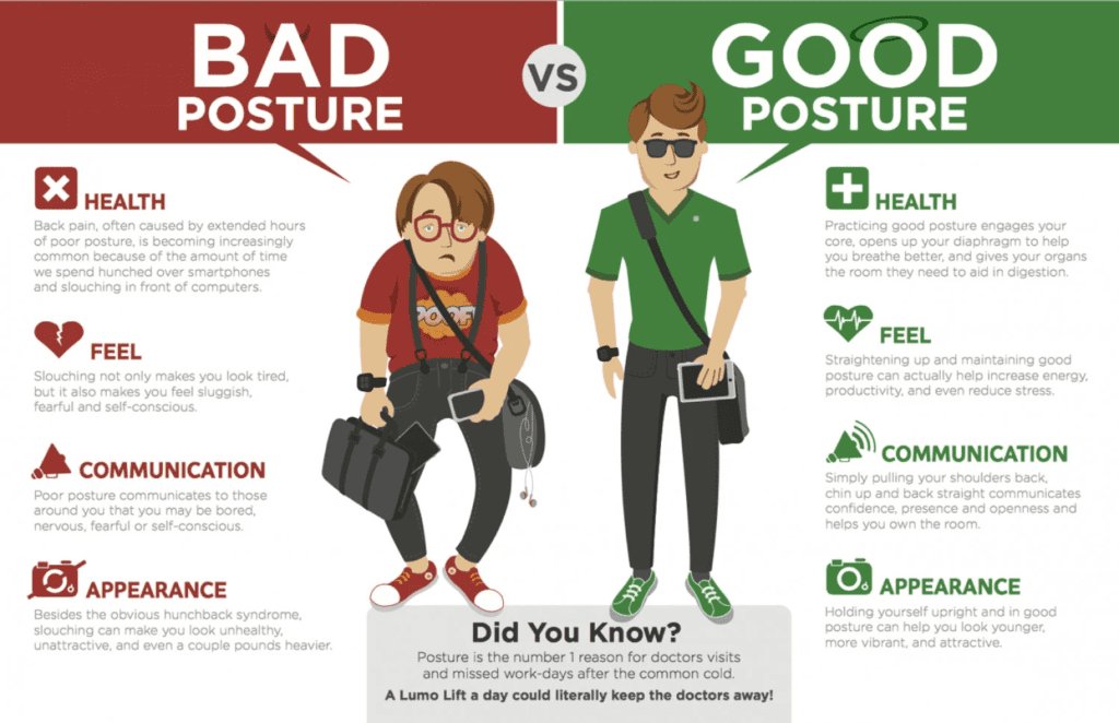
This infographic compares good and bad posture. The bad posture section uses dark colors and down arrows to show negative effects like health issues and poor communication.
The good posture section has light colors and arrows indicating benefits such as improved breathing, mood, and appearance. A “Did You Know?” section provides extra context.
The visual contrast and concise text allow viewers to quickly grasp how posture impacts well-being, showing how even something as simple as an infographic can motivate better health through images.
These three infographics exemplify why infographics are powerful comparison tools. They transform complex information into simple yet compelling visual stories. Using graphics, images, and minimal text, they enable viewers to instantly identify differences and similarities, something that would require far more words to convey verbally.
For content creators seeking to educate and influence, infographics provide an unparalleled medium to showcase expertise and insight. Their wide appeal and shareability also help spread your content, expertise, and brand far and wide.
Infographics should be a key part of any content toolkit. They have a visceral impact that makes comparisons and complex relationships easy to understand. For audiences overloaded with information, infographics cut through the noise to deliver knowledge and ideas. They transform how audiences think and motivate positive change. For brands, they build reputation, trust, and authority. Infographics bring the power of visual communication to life through easy-to-understand comparisons.