Whether you’re creating an infographic for the first time or are a veteran designer that is curious to see what is considered to be infographics best practices in 2020, this list will help you maximize your efforts so that your infographic is well thought out, focused, impactful, and extremely shareable.
Because of how powerful they are at helping people not only visualize but also retain data, infographics are becoming an increasingly more popular trend in the digital marketing world.
Without further ado, here are the 14 most important infographics best practices for 2020:
Getting to know your audience and creating a content marketing pipeline to keep them entertained is a whole separate project in and of itself.
However, assuming that you’ve already identified that market, sticking to topics they crave and planning content around those interests is one of the most important steps when planning out your infographic.
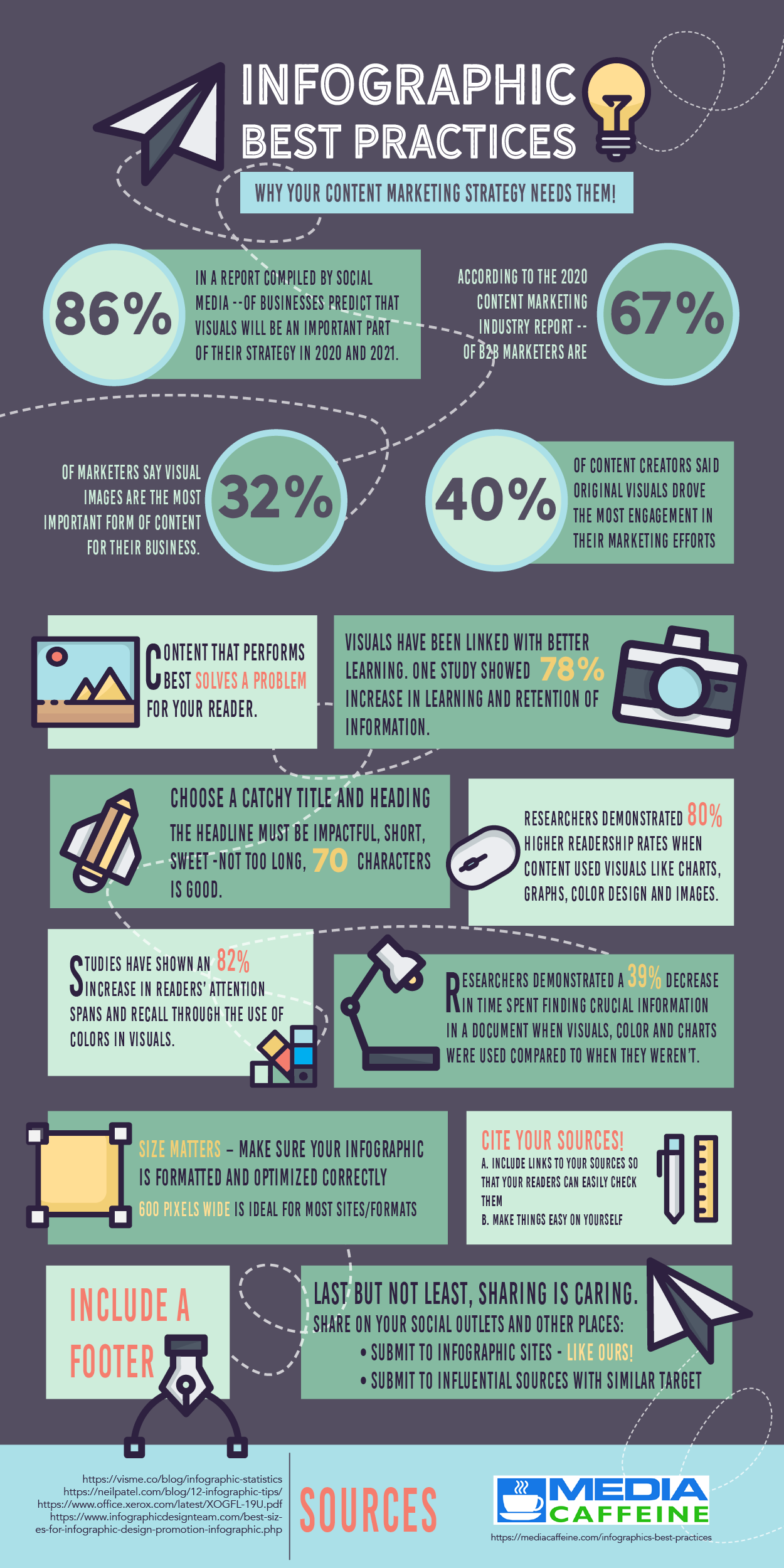
Content that tends to perform best across the internet are articles and infographics that solve a problem for your reader.
A recent study showed that pairing visual aids with instructions can actually improve productivity. In the study, one group was given instructions with visuals while the other was given instructions without any visual aid.
This study resulted with a 15% boost in productivity for the group that were given visuals versus the group that had none.
So instead of just writing a how-to article, craft up an eye-catching and helpful infographic to steer your readers to success!
How-to content is a particularly easy way to answer questions that your target audience might have. For example, a coffee roaster could share an infographic on how to pick the perfect coffee for your needs or how to create the perfect at-home latte.
It probably goes without saying, but there’s a lot of questionable data flying around on the internet and #fakenews to be avoided. It’s your job to make sure that your infographic is dense with accurately interpreted stats and figures.
Here are just a few reliable sources where you can confidently acquire a wide variety of data points to support your article’s topic:
University-backed research papers are another resource you can tap into as well. And while you should never cite Wikipedia as a source, it’s totally acceptable to rifle through the references and bibliography sections listed under your topic’s page to find a legitimate source to pull your data from.
For a more comprehensive selection, check out these resources from Hubspot and Marketing Dive.
There are a number of different facets to consider when deciding how you want to visually display your facts and numbers in an infographic. Picking a theme is so much more than just choosing a color scheme, but we’ll touch on that too a little bit later!
You want to make sure that not only does your infographic’s overall theme bodes well for your audience but it should match up with the topic as well.
Statistically speaking, visuals have been proven to improve learning, with one study showing an increase in learning and information retention up to 78%.
With our coffee roaster example, you may decide you want to use coffee beans as a way to provide a visual indicator for how dark or light a particular coffee blend may be roasted to. That would definitely pair well with that theme.
However, if they decided to randomly use steak knives to denote how dark or light the roast is… well, that just wouldn’t make sense.
The headline of your infographic needs to be impactful, short, and sweet. You want to get your point across but only in so many words. Our SEO pal, Neil Patel, says that 70 characters is a good cap to keep your title at.
Anything longer and you’re at risk of losing your reader’s interest before they even see the stunning infographic you put together for them!
No matter what theme you pick for your infographic design, it is imperative to arrange your content so that it makes sense and keeps your audience’s attention. Keep it simple, focused, and to the point.
When properly laid out with a nice flow, infographics have the power to transform the way people understand and interact with data. In a study, researchers encountered a 39% decrease in time spent finding essential information in a document when visuals, charts, and color were used compared to when they were left out.
This is by far one of the easiest infographics best practices to overlook, but it’s not difficult to get it right with proper preparation.
One way to plan for this is to create a simple outline of the information you want to include in your infographic and meticulously organize it well before graphics ever start hitting your canvas. Hand drawing a mockup of where you may want to include charts or specific graphics can be useful as well.
When it comes to planning and researching for an infographic, it’s easy to get wrapped up in all of the qualitative data that surrounds your topic. You’ve put together your outline but suddenly, you have a graphic that is overcome with full blown paragraphs of information.
You have to realign your vision and extract the high-level data points from all of that wordiness. Focus on the visuals, and highlight more percentages and numbers so that your work doesn’t become too copy heavy.
Multiple studies have shown that content using visuals can positively impact readership rates, productivity, and reading comprehension. One demonstrated 80% higher readership rates when content used visuals like charts, graphs, color design, and images.
Another group of brain researchers determined that individuals following directions with text and illustrations do 323% better than those following directions without them. And a third set of public safety researchers discovered that infographics improved reading comprehension by 50% amongst their participants.
So while it’s clear that graphics themselves play a very powerful part in your design, in the same measure you also don’t want to overpack it with too many graphics either.
White space is necessary so that your key takeaways are easily visible and digestible. As with all things, balance is key.
Less can truly be more when it comes to how impactful your infographic will be when you let white space work its magic. And, it may even same you some work as well!
There is an exorbitant number of stats that show how important of a role color plays in your infographic design, which makes this one of the most important infographics best practices of all. Improved data retention, increased attention spans, greater memory, and improved reading comprehension are just a few of the reasons why properly implementing color throughout your infographic is vital to your mission.
One study showed a 70% increase in reading comprehension when using color in visuals, while others have shown an 82% increase in readers’ attention spans and recall through their use as well.
All that being said, if your color is organized effectively all that could be for not. Let’s review a few tips and a couple of impressive stats to back ‘em up.
One study proved that not only is information located 70% faster when it’s in color, but it’s also 39% more likely to be remembered as well. When you have the whole entire color wheel at your fingertips, picking the right hues and tones to highlight impertinent info and downplay some of that on-page fluff can become an overwhelming task.
Avoid this problem by using a free and easy to use a color picker tool to create a simple and effective palette for your design. These tools can save you hours of headache deciphering which colors work best with each other.
Simply choose a base color and sift through a number of color varieties that are proven to flow well. HTML Color Codes offers a free color picker tool shades, complementary, triadic, tetradic, analogous and so many other color schemes to make choosing the right colors for your design a total breeze (and it’s fun to play with too!).
Circling back to the example of how-to content, another study on color, visuals, and learning, found that there was an 80% decrease in errors when visuals were used to explain a task.
Executing the right color theme could make or break your reader’s success rate in terms of completing your how-to task! So if you were considering skipping past one of our infographics best practices, it definitely shouldn’t be this one.
Not only does this help simplify your color choice debacle but studies have also shown that color can improve brand recognition by up to 80%.
So not only are you getting your point across more effectively to your reader, but they’re also going to be more likely to remember where they learned it from!
This is just one of the ways that following our infographics best practices helps keep your brand’s marketing on target.
This may sound easier than it actually is, but you definitely want to make sure your fonts are easy to read and pair well with each other.
The #1 tip in this arena is to ensure that the smallest font is easily readable, no matter how your design may get resized.
You may have to adjust your design a few times to get this right, but the extra work will pay off as your reader won’t have to abandon your infographic due to the inability to decipher your lines of text.
If you’re new to font pairing, take the guesswork out of the equation and use a free tool like FontPair to find fonts that complement each other perfectly. They will help you find strong header fonts, perfect subheading styles, and easy to read paragraph text that all mesh harmoniously.
Ideally, you want to target your resolution at 150, but anything over 300 is too large as it can affect the load time of your design and doesn’t work well on mobile.
Meanwhile, the goal should be to keep your final PNG under one MB, or under 1000 KB, which further affects the load time of your graphic and can decrease the overall user experience for your visitors.
In terms of actual pixels, you want to make sure your infographic is the ideal length and width, but beware, bigger isn’t always better. Neil Patel recommends a max length of 8,000 pixels, anything longer than that may threaten losing the attention span of your reader.
While the actual length can vary quite a bit depending on the amount of information you are trying to convey, it’s pretty universally accepted that the ideal width for most sites and social platforms is 600 pixels wide.
No matter where you pulled your info, you should include a citation section showing where it came from. For most infographic builders, your stats are likely going to come from the internet, so make sure to include the article URL in the citation, and even provide a hyperlink when possible so that your readers can easily check your sources.
It may seem like one of the more tedious infographics best practices on our list, but we promise it’s worth it, as you’ll be boasting credibility and professionalism from the footer or your design.
Has it been a while since you had to write a college paper backed by a list of citations? Make it easy on yourself by using a free citation tool like EasyBib. Choose from APA, MLA, and more with just the touch of a button.
In addition to your citations, you should have a footer section that includes the following:
Now that your infographic is mostly complete, it’s time to double-check your stats, your sources, and everything else in between. Scan our infographics best practices article like it was a checklist and make sure it meets all of the criteria above and below.
This is also your window of opportunity to pare down content that’s too wordy and add in some whitespace if you feel like your design is too busy. But make sure to save those wordy paragraphs for later, you’ll see why in our next step!
Finally, have a colleague proof your work, as they may catch flaws in your design or typos in your text that you couldn’t see because you’ve been looking at it for far too long (it’s ok to obsess, we get it). And if your deadline allows for it, set your work aside for the rest of the day and run one final edit the next day.
Provide SEO-support for your infographic by writing a blog to go along with it.
Remember all of that content that was too wordy to include in the layout of your infographic? Now you can easily upcycle all of that verbiage, and if you wrote out a detailed outline for your design all you have to do is fill that bad boy out and voila! Your blog is done.
Not only will this help your infographic pop up in search results for search engines like Google and Bing but this also gives your infographic a digital home to live in.
Pro blogging tip: try to push your word count past 1500 for best results, and don’t forget to include your infographic’s title in the alt-text!
It’s time to show off all of your hard work. Share this baby on all of your social outlets including:
Everyone loves a free resource, so don’t forget to send your infographic to different sites outside of your own. You can submit to infographic sites like ours and also search for other influential sources with similar target audiences to your own that may also find your infographic helpful.
And for visitors who came directly to your blog or landing page, make it easy for them to share as well. Feature embed codes so they can rapid fire copy/paste your design (with the proper dimensions!) wherever their heart desires.
Let our professional team of designers go to work for you! Whether you don’t have the time, tools, skillset, or just flat out energy to create your own according to these infographics best practices, our experienced team is here to help. Contact us and let’s get started designing your new infographic today.
Please contact us for a complimentary analysis of your current digital marketing strategy.
Email Sales@mediacaffeine.com
Call Now! 888.963.9617