Don’t just be trendy. Rebrand your business with the logo design that makes the most sense for your brand.
Logo design plays such an important role in your brand’s development. It’s the face of your company – the first thing your customers see – so it’s important to consider the imagery that will tell the story of your brand to your target audience.
Think about this – how many times have you seen a logo on the side of a van or at an entry door and thought, “Huh? I don’t get it?” I’m sure you have a few examples that immediately come to mind. This reaction is the worst thing your brand could experience, and designers want to make sure that this never happens.
So how do you create an amazing brand, that makes sense for your market, all while still being original?
Before starting on your new business’ branding, the first thing to do is to check out what is currently trending in logo design and then what is trending in your industry. Remember, you want your logo to make sense to your audience but still be innovative.
The next step is to analyze these trends and take stock of what will actually translate best for your brand and the loyal customers you already have. Being trendy isn’t always the best solution. A design that works well for one brand could make no sense for another.
Let’s check out some of our favorite logo design trends in 2021 and analyze their pros and cons.
Simplicity
Okay – let’s be real. Simplicity has been trending throughout graphic design for the past couple of years. I have a few bones to pick with simplicity. While I am totally on board with simplifying outdated artwork, there is such a thing as over-simplification. Shutterstock calls this “blanding,” and I couldn’t think of a better term to describe this form of simplification.
“The term “blanding” refers to the oversimplification of both established and up-and-coming brands alike.”
Alex Clem | Shutterstock
Let’s look at a few examples of this.
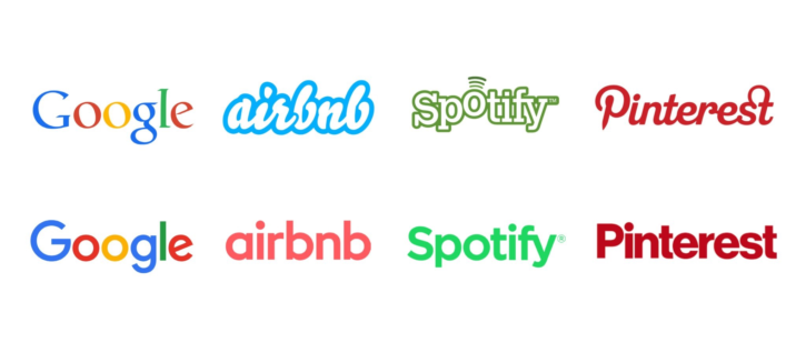
Simplification, or “blanding,” tends to take place with wordmarks often. Big brands let the typeface do the heavy lifting. Maybe they do this because their brand is so recognizable? Or maybe their CMO said, “It’s time for a change.”? Regardless of the reason, it just leaves the consumer and designers like myself – underwhelmed.
Now let’s look at some brands that excelled in the simplification department.
Each of these logos are simplistic in their design, but they are visually engaging and use shapes and lines, and in some cases type, to create a sense of movement within the design.
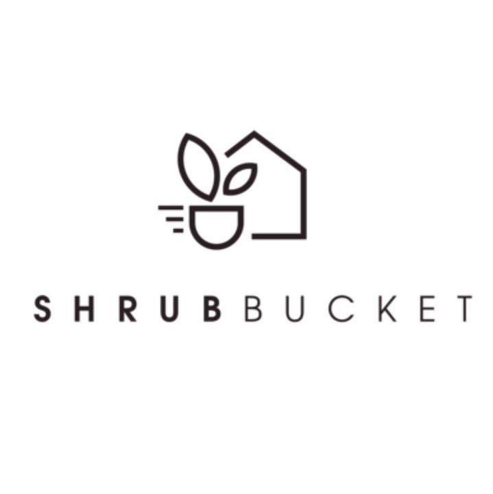
Stained Glass
This trend is a personal favorite of mine. These playful designs are great for brands that are looking to tell a story about their artwork, especially if the location of your business is important to your branding.
These logos create great opportunities for animation as well. Check out this example!
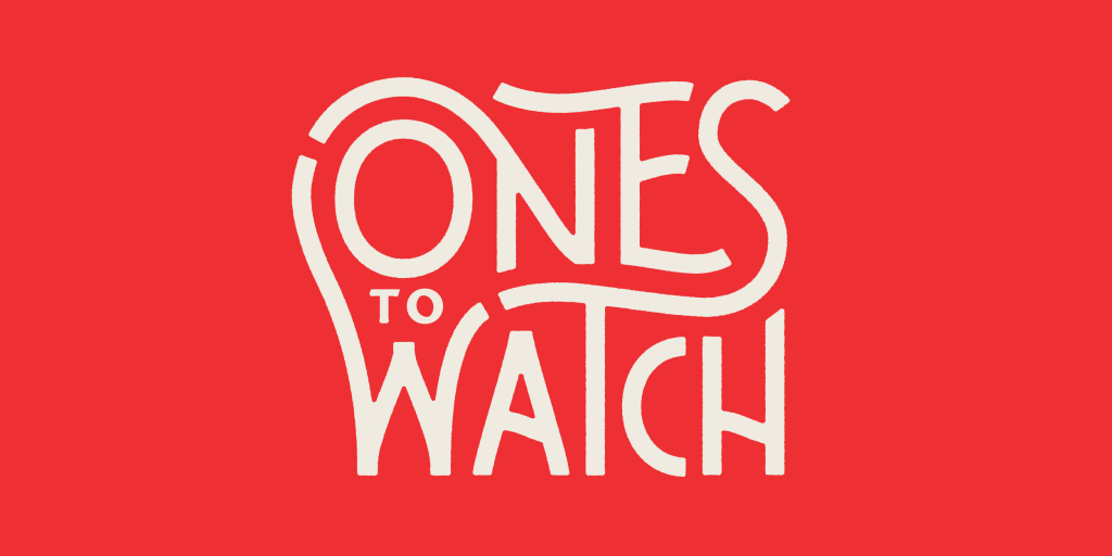
Creative Wordmarks
If you are looking for inspiration for a creative wordmark, you have to check out Hoodzpah Design. This twin sister design duo has created amazing wordmarks and branding for companies like RedBull, Disney, and Airbnb Magazine. Their custom typography puts a creative spin on the wordmark – “blanding” is never applicable in their designs.
One could say I’m partial to their work. Here are some creative wordmark logos that you may recognize from Hoodzpah.

If you think that a wordmark would be the best fit for your business, consider working with a designer that can create a custom font for you, rather than using commercial typefaces that are available. Doing this will give you a custom look and feel that no other company will have because it will be created just for you.
Transformed Letters
This logo trend is a perfect transition form a custom wordmark. Designers are coming up with more new and inventive ways to showcase the iconography and messaging of a brand within type. Many times, these designs are simplified to one letter.
Recognize this popular logo? Peloton is a perfect example of a transformed letter. The letter “P” is easy to recognize but we can also see the imagery of the wheel – symbolizing their iconic spin bike.

Image source: https://www.onepeloton.com/
These are a few of our favorite logo trends in 2021 but there are so many more trends that are catching the eyes of marketers and designers alike.
If you are interested in checking out some more logo trends check out some of these great blog articles: