Make Your Data and Ideas Easier to Digest
Infographics present data and concepts in a visual format, using graphics like charts, graphs, and diagrams. Infographics in PowerPoint makes the information much easier for your audience to understand quickly. Rather than listing stats and numbers in bullet points, you can display them in an eye-catching chart. Instead of explaining a complex process in paragraphs, show it in a simple flowchart. Infographics help turn boring, dense data into an engaging visual story.
Read on to learn the top reasons you should be using infographics with PowerPoint.
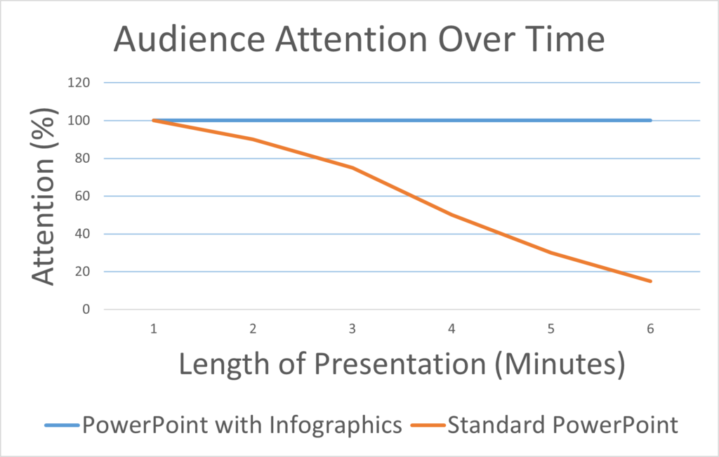
Keep Your Audience’s Attention
In today’s world of short attention spans and information overload, it is challenging to keep an audience focused during a presentation. Infographics give your viewers something visually interesting with which to engage. Their attention will be drawn to the graphics, and they are more likely to retain that information. Visuals also break up the monotony of slide after slide of text and bullet points. Strategically placed infographics will make for a more dynamic presentation that holds people’s interest stronger and longer.
Make Your Slides More Memorable
Our brains process and retain visual information far more effectively than text. We remember stories, faces, images, and graphics much more vividly than words alone. By incorporating infographics into your PowerPoint presentation, you make the information more visual, more engaging, and more memorable for your audience. Even after your presentation ends, viewers are more likely to remember those impactful graphics and the stories they told. Infographics give your slides longevity and long-lasting power.
Show Data and Ideas More Effectively
Some concepts and statistics are best conveyed visually rather than through text alone. For example, trends over time are much easier to understand when displayed on a line or bar chart. Part-to-whole relationships are better demonstrated with a pie chart. Geographical data suits a map. And some ideas are simply easier to grasp when shown in a diagram. Infographics are ideal for data and concepts that translate better visually than verbally. They enhance understanding and give your audience an “a-ha” moment.
Add Visual Interest
Infographics make your PowerPoint slides more visually compelling and interesting. Audiences tend to lose focus listening to a speaker talk over a series of text-heavy slides. Infographics add color, style, and graphical elements that bring your slides to life and make viewing them an enjoyable experience for the audience. When people see an infographic, they want to look at it and explore what it represents. This helps to combat PowerPoint fatigue and keeps your viewers engaged.
Infographics are a simple way to transform your PowerPoint presentations. They make your data and ideas easier to digest, keep your audience’s attention, show information more effectively, make your slides memorable, and add visual interest. The next time you create a slide deck, consider how infographics might enhance your key concepts. With a few eye-catching graphics, you can take your presentations from boring to brilliant.